
Appearance
Exercise 2 - Discover Hidden Insights
Step 1: Meet Tableau Next and Tableau Semantics
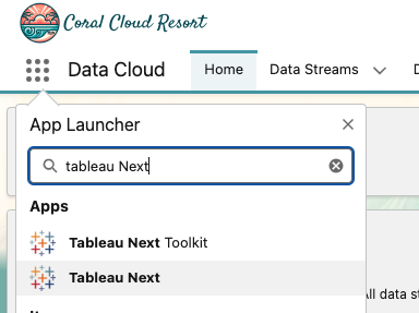
Navigate to the Tableau Next App from the app finder.
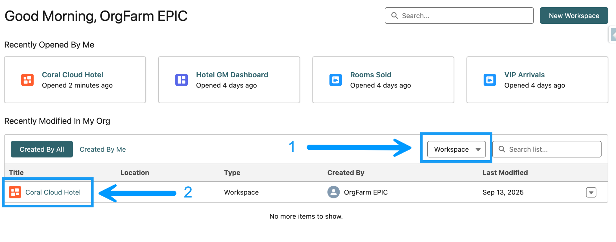
Click the All Asset Types dropdown, and select Workspace. Click on the Coral Cloud Hotel Workspace.

A Workspace is a flexible, structured palace where you can create and reference analytic assets, like data sources, semantic models, visualizations, and dashboards, to answer questions about your data. Think of a workspace as a well-equipped workshop with all the tools and supplies you need to create something meaningful from your source material, data.
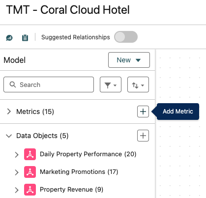
Open the TMT - Coral Cloud Hotel Semantic Model
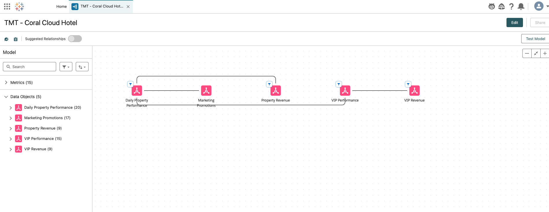

Here you can see 5 data objects, connected by relationships. Data Objects in your semantic layer can be Data Model Objects (DMOs), Data Lake Objects (DLOs), and Calculated Insights (CIs).
Relationships are flexible connections between different tables based on common fields. The Semantic Layer can be used to establish relationships between your data objects to enrich your data model without the need to define the join type. Think of a relationship as a contract between two tables. When you’re building a visualization with fields from these tables, the Semantic Layer brings in data from these tables using that contract to build a query with the appropriate joins.
By default, any relationships that were mapped between DMOs in Data Cloud are automatically transferred into the model. Any existing relationships that can create circular relationships (relationships that reference the same object multiple times) are automatically removed. If no relationships were inherited, you can create your own.
There are two ways to create relationships. You can create them manually, or you can use Semantics AI and let Einstein show you suggestions based on your data objects and have them drafted for you.
Step 2: Create a Metric for Promotion Bookings
A Metric is a business KPI that you can track over time and use to assess performance or business processes. The core components of a metric are a measure or calculated field representing the KPI, and a time dimension that tracks its development over time.. You can also apply sentiment to a metric (for example, up is good or bad), aggregation (for example, sum, non-cumulative, average, minimum, maximum), and other business contexts.
Select Edit in the top right corner
Select the plus button next to the “Metrics” section. We are going to create a metric that tracks how many hotel bookings were made from marketing promotions.
Enter the following information:
Name:Promotion Bookings
API Name:Promotion_Bookings_mtc(should auto-fill)
Description:Bookings generated from marketing promotions
And then click Next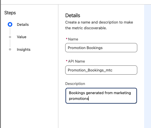
On the next screen enter the following:
Measure:Attributed BookingsNext, open Measure Advanced Setup and enter the following:
Sentiment:Up is Good
Aggregation:Sum
Aggregation Type:Non-Cumulative
Time Dimension:Marketing Promotions.Date
Additional Dimensions: (use search bar to add multiple dimensions, one after another)Target Guest Segment
Promotion Name
Channel
Click Next, and then click Save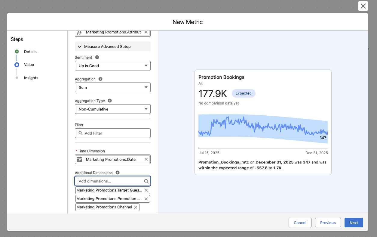
Step 3: Track Progress of Promotion Bookings
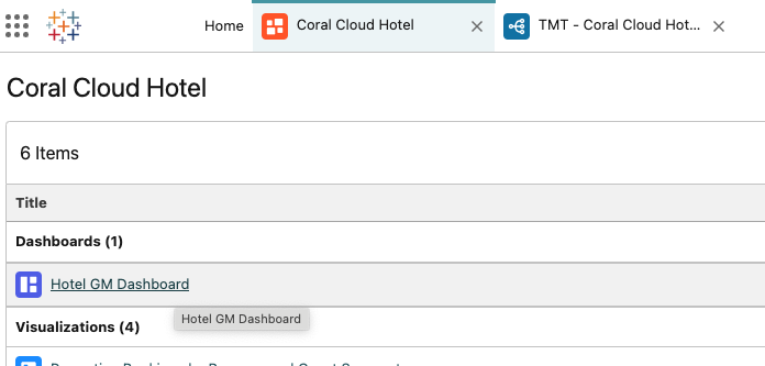
Navigate back to the Coral Cloud Hotel Workspace tab at the top of the screen and open the Hotel GM Dashboard
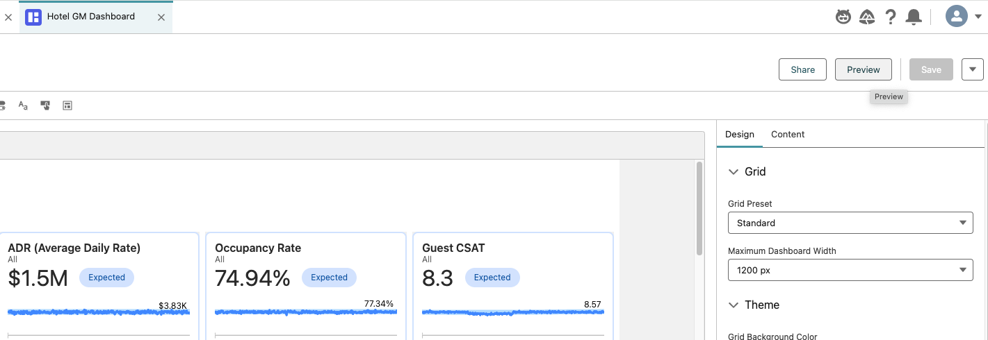
If the dashboard is in edit mode, select Preview in the top right corner
Analyze the Dashboard
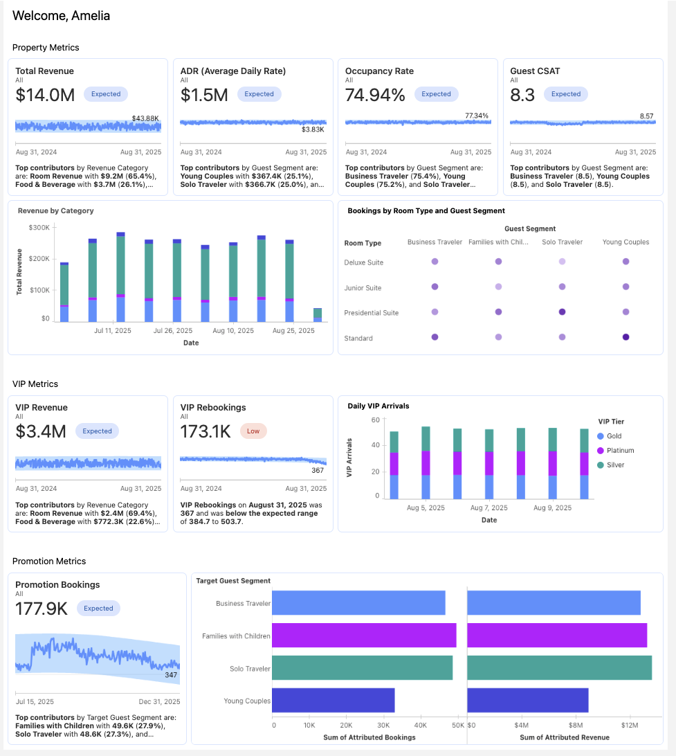
Here we see Amelia’s dashboard that she uses to keep up on the performance on her property. Amelia would like to add the Promotion Bookings metric to her dashboard.Click Edit on the Dashboard
Select the Text object at the top of your screen, and drag it onto the bottom of the dashboard. Leave a row of space in between the text object and the VIP metrics.

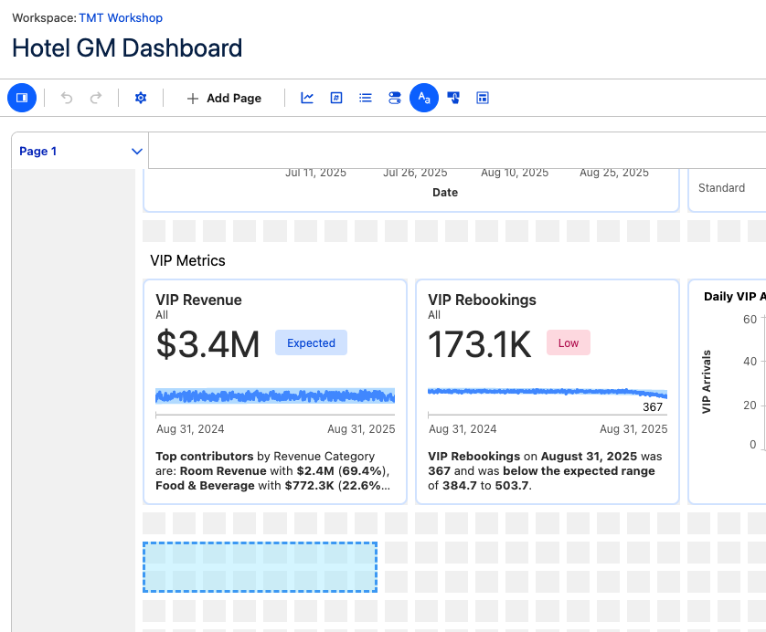
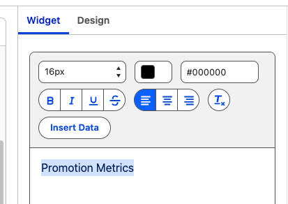
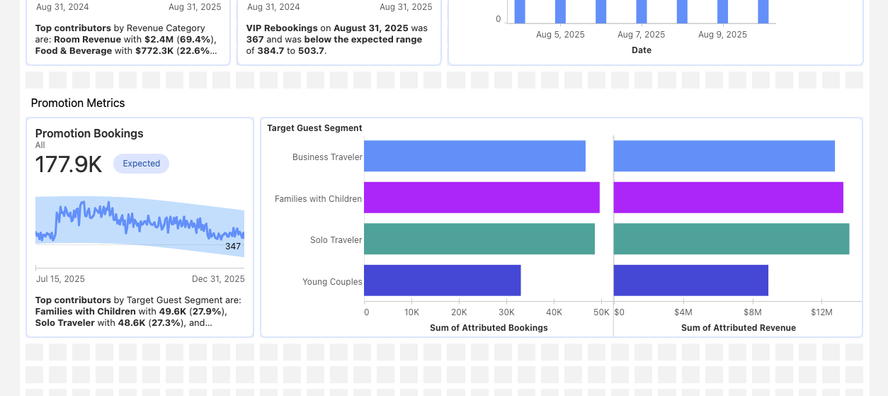
In the widget box, enter “Promotion Metrics”
Then highlight the text and change the font to size 16
Make the text component one box tall instead of two
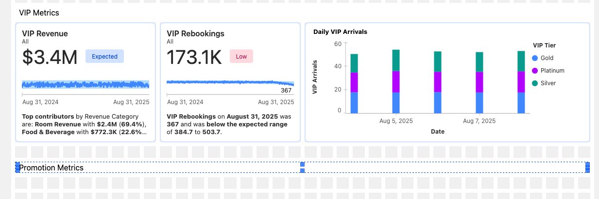
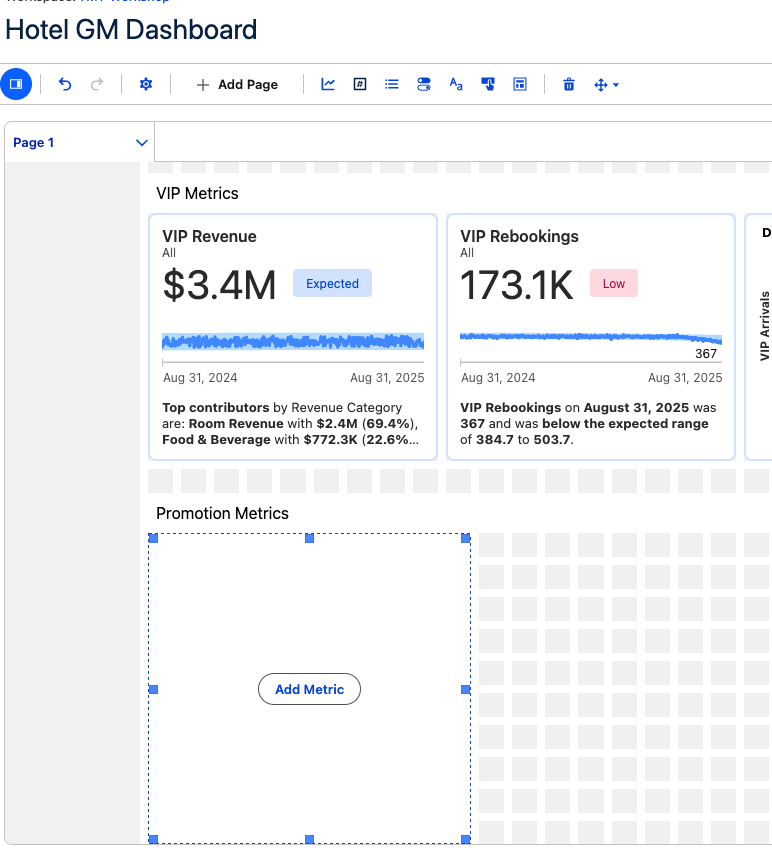
Click on the Metric component and drag it under the Promotion Metrics text component

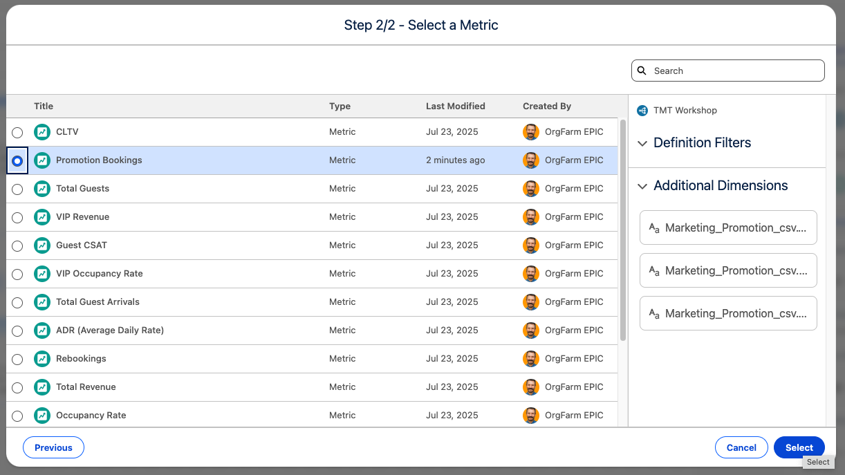
Select Add Metric > Select > Promotion Bookings > Select
Click Save to save your Dashboard.
Click Preview.
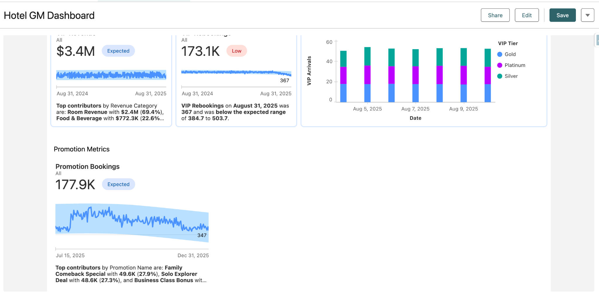
Your metric is now added and available on your Dashboard.
Step 4: Utilizing Tableau Next Dashboards and Concierge
Now you’ll take on the role of Amelia, the coral cloud hotel GM. She uses this dashboard to keep track of her property’s performance.
Analyze the Dashboard
Here we see Amelia’s dashboard that she uses to keep up on the performance on her property. As we take a look through the visuals, we can see that VIP Rebookings is Low and has experienced a recent dip.
Luckily Amelia has her trusty sidekick, the analytics agent, at her fingertips and can dig into this issue.Open the Agent in the top right corner and toggle to the Analytics and Visualization Agent, if not already selected.
It looks like the dip started this summer, so let’s ask the agent:
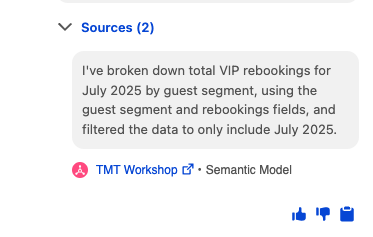
Break down VIP Rebookings for July 2025 by Guest SegmentOur agent responds with a visual and tells us its sources so we know exactly how it came to this conclusion, instilling trust in the data.
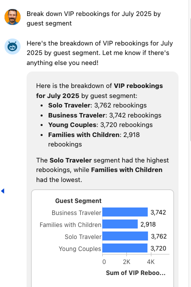
Now this surprises Amelia! The Families with Children guest segment is lower than the other segments, even though summer is the most popular time for them due to the school break.
She then remembers that the hotel pool was undergoing construction during the winter months, which is also a very popular time for this guest segment to visit, and the pool is the most popular amenity for kids. Let’s find out!
Ask the agent:
Show me CSAT over time for the families with children guest segment(visualizations may show up differently, but trend will still be apparent)
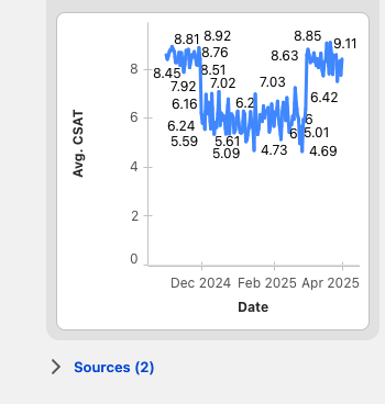
Amelia’s hunch has been confirmed - there was a significant dip in CSAT for the Families with Children guest segment during the time of the pool renovations.
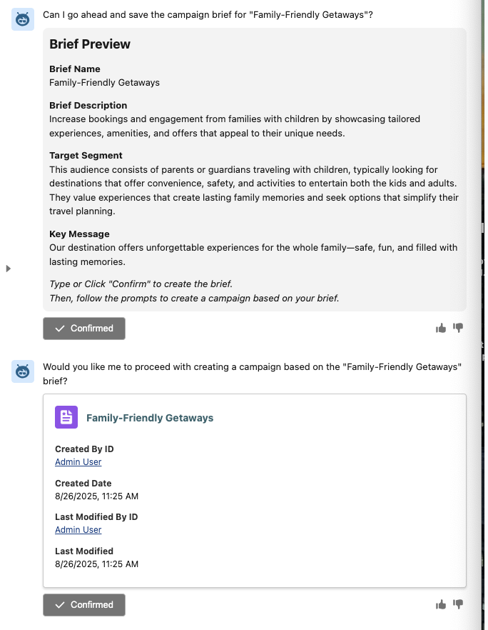
Next, let’s try to win some of this business back by targeting this guest segment with a summer promo campaign. Our agent can help us with this as well!
Ask the agent to:
Create a campaign targeting the Families with Children Guest segmentConfirm the brief and any following suggestions by the agent to create the campaign!
This completes Exercise 2.
Bonus TableauNext Section! (Optional)
In this bonus section, you will learn how to create Tableau Visualizations and how to add them to a TableauNext dashboard. Tableau Visualizations are a powerful way to represent data with many options.
Within the Hotel GM Dashboard, click Edit.
Add Visualization Component
 next to the metric on the dashboard
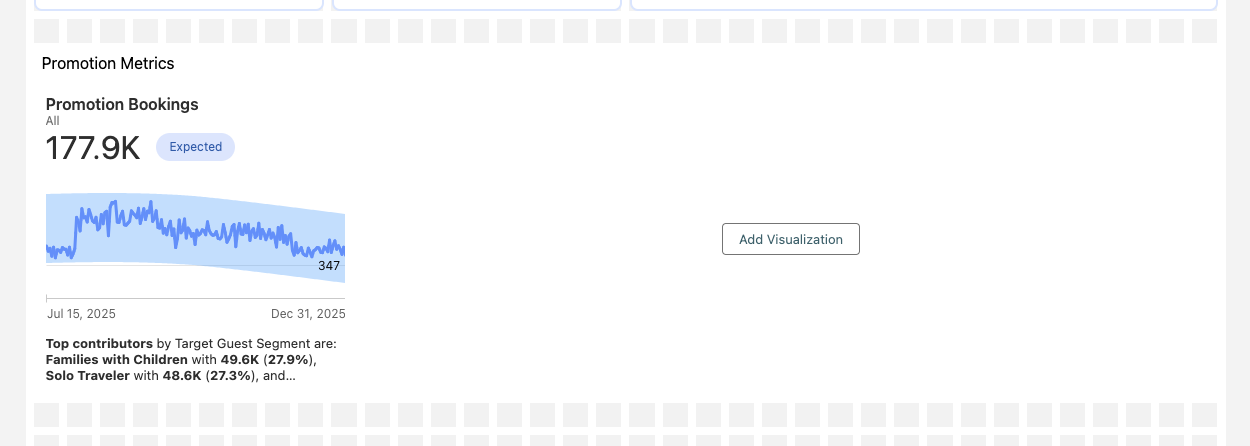
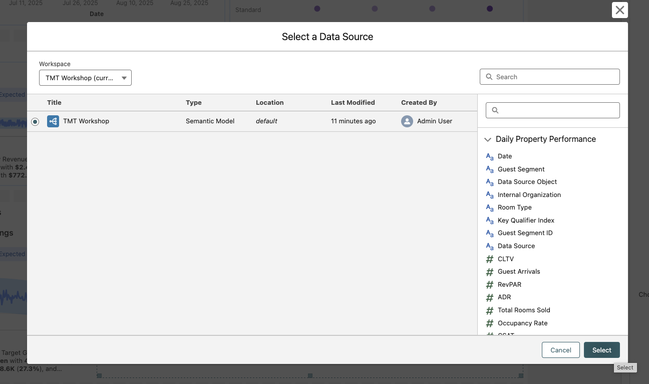
Select Add Visualization > Create New Visualization > Select
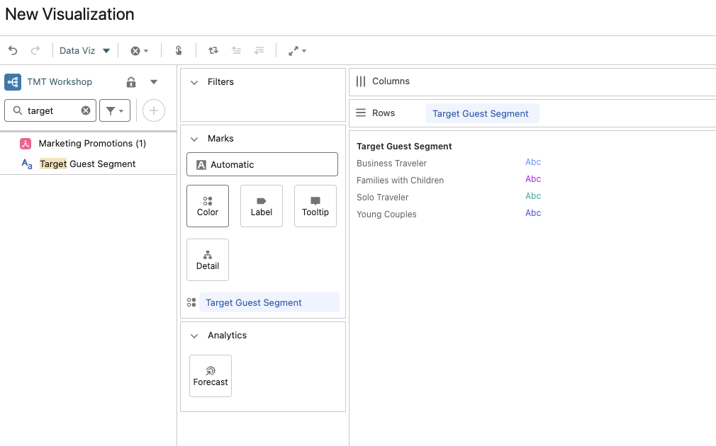
Search Target Guest Segment. Drag Target Guest Segment until it hovers on top of the Rows shelf. Then, repeat by dragging Target Guest Segment from the left side of your screen to the Color box inside of the Marks card.
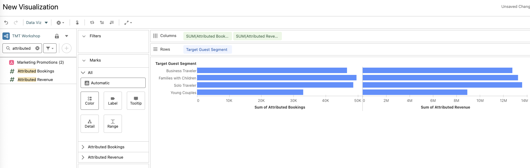
Search Attributed. Add both Attributed Bookings and Attributed Revenue to the Columns shelf by dragging and dropping.
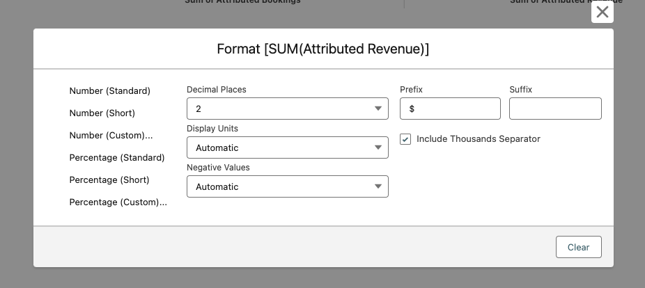
Hover your mouse over the SUM(Attributed Revenue) box inside of the Columns shelf. Select the drop-down caret. Select Format Number > Number (Custom)
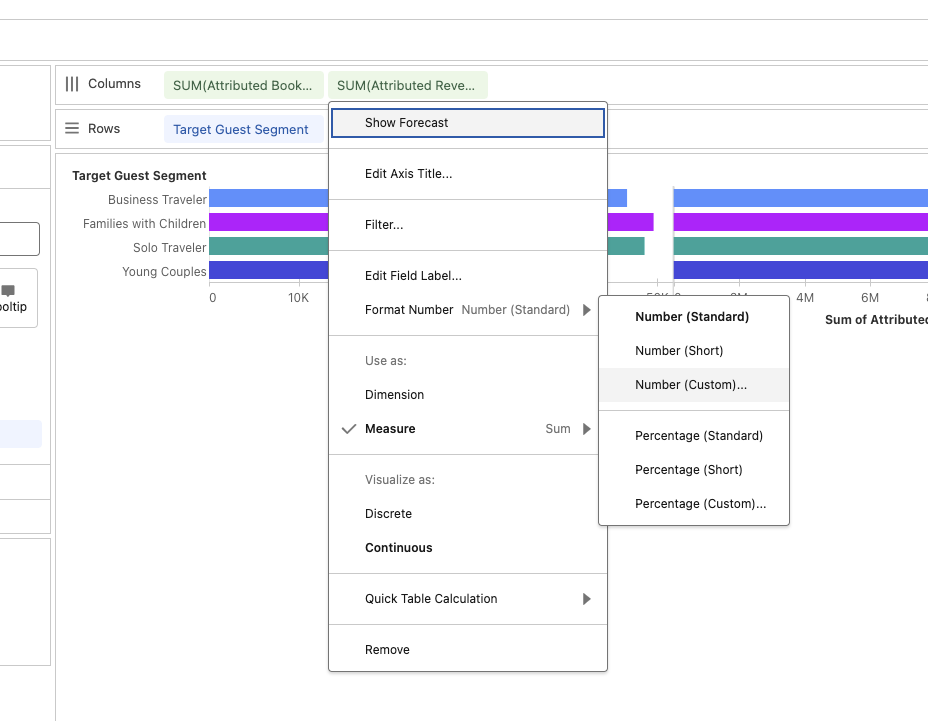
In the Prefix window, enter a “$” sign. Then click the X to close the window.
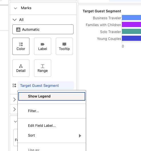
Hover your mouse over the Target Guest Segment box inside of the Marks card. Select the drop-down caret. Select Show Legend to remove the legend from the view.
Click on the Title which currently says New Visualization at the top and name the visualization Promotion Bookings and Revenue by Guest Segment
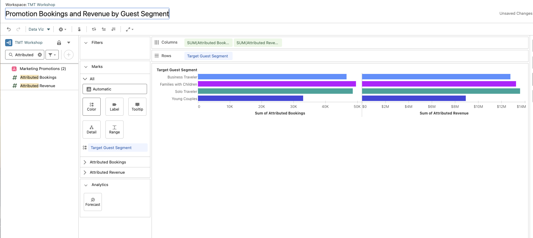
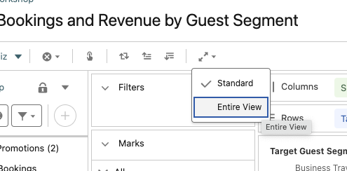
Change the fit size to Entire View
Select Save in the top right corner and navigate back to the Hotel GM dashboard tab at the top

Save your dashboard!
Optional: Format the Components:
Select the metric and toggle to:
Designon the right
Border color:#D6E6FF
Border:box
Border Width:2
Border Radius:8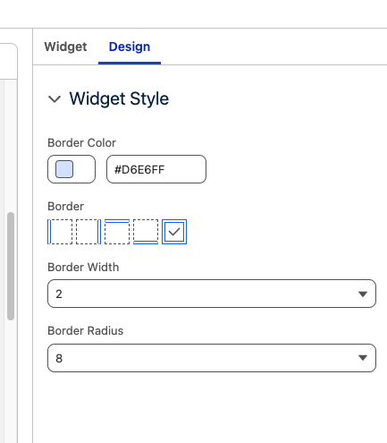
Do the same for the visualization
Save the dashboard and select Preview to view the final product!
This now completes Exercise 2.